
Dashboard UI/UX Design for Data-Driven Products
Turn complex data into clear, intuitive, and actionable experiences.
At Picto, we design dashboard interfaces that help users understand information quickly, monitor performance, identify trends, and make better decisions. From SaaS and enterprise dashboards to analytics and operational platforms, we create experiences that balance data, usability, and visual clarity.
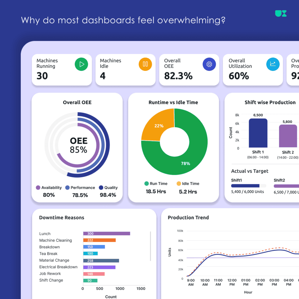
Dashboards Designed for Clarity and Action
Modern business applications often contain large amounts of data, multiple metrics, charts, tables, filters, and workflows. Without a thoughtful user experience, dashboards can quickly become difficult to understand and navigate.
We design dashboards that organize complex information into clear visual hierarchies and meaningful user journeys.
Our approach focuses on:
- Making important information easy to find
- Reducing unnecessary complexity
- Creating clear visual hierarchy
- Presenting data in an understandable way
- Supporting faster decision-making
- Designing interfaces that can scale with your product
Whether you’re building a new dashboard or improving an existing one, we help turn complex information into a more intuitive digital experience.
Our Process
We follow a structured UI/UX design process to turn ideas and business requirements into intuitive, engaging, and user-friendly digital experiences.
SaaS Dashboards
Design intuitive dashboards for software products that help users monitor activity, manage information, and understand key metrics.
Analytics Dashboards
Transform large datasets into clear visual experiences using charts, graphs, tables, filters, and meaningful data relationships.
Enterprise Dashboards
Design structured interfaces for enterprise applications where users need to manage complex information, workflows, and business operations.
Admin Dashboards
Create efficient interfaces for managing users, permissions, settings, content, configurations, and system activity.
Operational Dashboards
Help teams monitor processes, performance, resources, and real-time operational information through focused dashboard experiences.
Management Dashboards
Present high-level business metrics and performance indicators in a way that helps decision-makers quickly understand the current situation.
Our Dashboard UI/UX Design Services
We understand your users, business objectives, data requirements, and key workflows to establish an effective dashboard experience.
Information ArchitectureWe organize content, metrics, navigation, and functionality into a logical structure that makes complex dashboards easier to understand.
Data VisualizationWe design meaningful visual representations using charts, graphs, tables, cards, indicators, and other appropriate visualization patterns.
User Flows & WireframesWe map important dashboard workflows and create wireframes to establish layout, hierarchy, navigation, and functionality before detailed UI design.
Dashboard UI DesignWe create clean and visually engaging interfaces with consistent layouts, typography, colors, components, and interaction patterns.
Responsive Dashboard DesignWe design dashboard experiences that adapt to different screen sizes and devices while maintaining usability and information hierarchy.
Design SystemsWe create reusable dashboard components and design patterns that support consistency and scalability across the product.
Dashboard Redesign We evaluate existing dashboards and redesign confusing layouts, outdated interfaces, and difficult workflows to create a more effective user experience.Designing Data That Users Can Understand
A dashboard should not simply display data. It should help users understand what the data means. We carefully consider how different types of information should be presented.
Key Metrics
Highlight important numbers and performance indicators so users can understand the current status at a glance.
Charts & Graphs
Choose appropriate visualization patterns to make trends, comparisons, and relationships easier to interpret.
Tables
Organize detailed information into readable tables with sorting, filtering, pagination, and appropriate hierarchy.
Filters & Search
Help users quickly narrow down large datasets and find the information relevant to their task.
Alerts & Notifications
Make important changes, exceptions, and critical events visible without overwhelming users.
Drill-Down Experiences
Allow users to move from high-level information into more detailed views when deeper analysis is required.
Frequently Asked Questions
What is dashboard UI/UX design?
What types of dashboards does Picto design?
Can you design dashboards for SaaS products?
Can you redesign an existing dashboard?
Do you design data visualizations?
Can dashboards be designed for multiple user roles?
Do you create responsive dashboards?
Can you work with our development team?
Do you provide a design system?
UI/UX Design Collaboration
Picto collaborates with UXinity, a UI/UX and software design studio specializing in dashboards, SaaS products, web applications, and digital experiences.
Together, we help businesses transform complex product requirements and data into intuitive, engaging, and scalable digital experiences.
Let's Turn Complex Data Into Clear Experiences
Whether you’re building a new SaaS dashboard, analytics platform, enterprise application, or redesigning an existing product, Picto can help create an experience that makes information easier to understand and act upon.
Let’s create a dashboard that works for your users and your business.